A Few Favorites: 4 Tile Designs We Love
- By Design Interiors
- Mar 10, 2023
- 3 min read
Updated: Apr 9
There's no question - we love tile! It elevates a space through texture, pattern, color, etc. Here are a few of our favorites:
1. Zellige Tile (Handmade Tiles) :
This handmade tile is a favorite of Senior Designer, Ayca Stiffel. Its unique design is crafted from clay for an organic, artisan look. There is no piece of tile that looks the same, each varying in color and texture. This variation adds depth and character to your kitchen or bath; creating an antiqued, 'old-world' feel.
Below: Ann Sacks zellige tile is used in Ayca Stiffel's Antique Elegance project, located in the gorgeous neighborhood of Willowcreek Ranch. Note, how the variation in the shades of grey, texture of tiles, and little imperfections add another layer the space. It is a perfect accompaniment to the blue-green double islands.
2. Go Metallic!
If you're wanting to stray away from a patterned or decorative mosaic - but still want a bold look - consider a glossy or metallic tile. These are a great option when designing within a smaller or darker space, as the shimmer of the tiles will naturally reflect more light, making the room appear bigger and brighter.
As seen in our chic minimalist kitchen below: Senior designer, Ashton Joseph utilizes a smaller scale, high-gloss silver tile from Thorntree Slate to give the space a touch of glamour. The shimmer of the backsplash is balanced by calming grey cabinetry and streamlined pendants.
In contrast, Peggy Fuller's artfully updated master bathroom sparkles in a metallic glass, 3-dimensional tile from Crossville Studios. Its irregular, art deco-inspired design has a mirrored sheen that reflects the lagoon-blue granite of the vanity; creating the illusion a longer vanity wall. It's truly stunning! Both tile applications add the perfect amount of 'razzle-dazzle' to these spaces without being too overpowering.
The middle image is another great option: Bronze! The picket backsplash from Ann Sacks complements the earthy tones of the custom Wood-Mode cabinetry and granite countertops. This more 'subdued' metallic adds a richness to the Cypress, TX kitchen.
3. Pretty Patterned Mosaics:
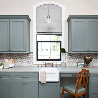
We love a patterned mosaic tile too. It turns a blank wall into a work of art! This elegant green-grey mosaic from Stone Impressions adds a soft femininity to this utility room by Ayca Stiffel. The tile is nestled between custom cabinetry in a similar misty-green hue (one of the homeowner's favorite colors), and then mimicked along the opposing wall a cohesive overall design.
4. Texture and Natural Stone:
Textured tile is ideal for adding depth and visual interest to a monochromatic or neutral color palette. Our senior designer, Ayca Stiffel, is a pro at this. She loves to incorporate organic, textured tile into her designs. The two kitchens below are her designs: The first, Ayca selected a multi-colored stone mosaic from Artistic Tile. It's art deco look is inspired by the jazz era of Louis Armstrong and Miles Davis! (A perfect complement to the silver vent hood.) Second, Ayca added Spanish Revival flair to the kitchen of her Bentwater project with 3-dimensional 'criss crossed' stone backsplash from La Nova Tile. The raised edges and variation in the natural stone add movement and depth to the neutral color palette.
Also, note the natural stone tile within our Lake Conroe master bathroom. This space was crafted for a bachelor - who wanted an easy, breezy, natural palette for his lakeside home. The natural stone was selected for its variation of size, texture, and color which adds an edge to this cool, waterside escape.
Now, these are just a few of our favorites...Trust us, there are many others we can share.
So, do you want to see more? Do you have a favorite tile design?
Let us know in the comments below!
Until next time,
- BDI


Beautiful display of remarkable backsplash designs. However, I don't see any electrical outlets 😮. Probably because they are always so ugly and disruptive to the wonderful tile designs. But they don't have to be. See the link below for a way to add some design to electrical outlets that accentuates and does not detract from your design.
https://www.legrand.us/wiring-devices/designer-switches-and-outlets/switches?gad_source=1&gclid=EAIaIQobChMIppqr-JmbggMVJ9DCBB2tfQyWEAAYASAAEgKXkPD_BwE